Layout Design Patterns
John Ferris
aten.io
I'm the Lead Front-end Developer at Aten Design Group in Denver, CO.
We work with organizations doing good work all over the world
Design Patterns
## These are Design Patterns
Common solutions problems context
"Common solutions to reoccurring problems within a given context"
Reoccurring Problem
I get Hangry
"Common solutions to reoccurring problems within a given context"
Common Solution
TACOS!
"The taco design pattern is delicious"
Given Context
You like tacos.
You can make or buy tacos.
"The taco design pattern is delicious"
Layout
## Today we're going to look at few patterns we can pull from to solve more complex layouts.
Layouts are the structure of a screen
Layouts are made of containers in which content is placed
Layouts are recursive
Layouts are defined in markup (relationships and hierarchy are important)
and manipulated in CSS
using a subset of properties
CSS Layout
Box Model Properties
box-sizing
height
width
max-height
max-width
border-width
padding
margin
CSS Layout
Flow Properties
display
float
clear
overflow
flex-*
shape-*
CSS Layout
Position Properties
position
top
right
bottom
left
transform
z-index
Patterns
This defines the broad context in which our layout pattern language exists. We'll going to look at patterns for manipulating these properties and structuring markup to solve our layout problems.
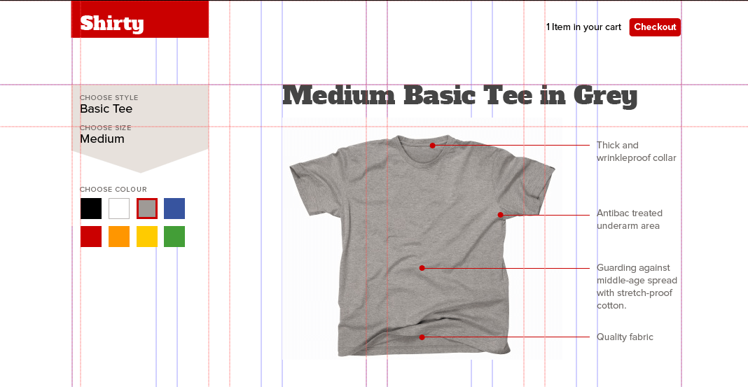
Constrained Elements
Give an element a defined width to prevent it from expanding too wide.
We'll start super simple.
The essence of this process is very fundamental indeed. We may understand it best by comparing the work of a fifty-year-old carpenter with the work of a novice. The experienced carpenter keeps going. He doesn't have to keep stopping, because every action he performs, is calculated in such a way that some later action can put it right to the extent that it is imperfect now. What is critical here, is the sequence of events. The carpenter never takes a step which he cannot correct later; so he can keep working, confidently, steadily.
The novice by comparison, spends a great deal of his time trying to figure out what to do. He does this essentially because he knows that an action he takes now may cause unretractable problems a little further down the line; and if he is not careful, he will find himself with a joint that requires the shortening of some crucial member – at a stage when it is too late to shorten that member. The fear of these kinds of mistakes forces him to spend hours trying to figure ahead: and it forces him to work as far as possible to exact drawings because they will guarantee that he avoids these kinds of mistakes.
We'll start super simple.
This is as basic as it gets. And that's the beauty of it.
This one pattern, can be applied to a variety of contexts
Making sure text is readable by maintaining a comfortable measure.
.l--constrained
And making sure elements stay aligned on large screen sizes.
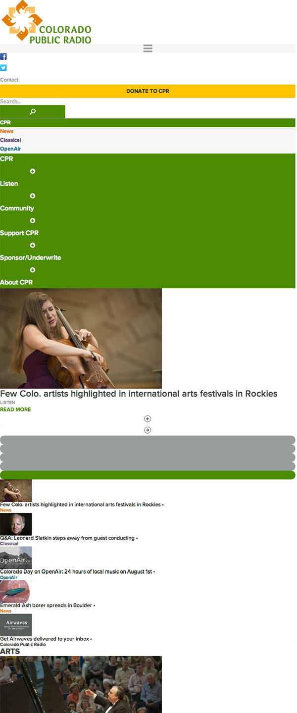
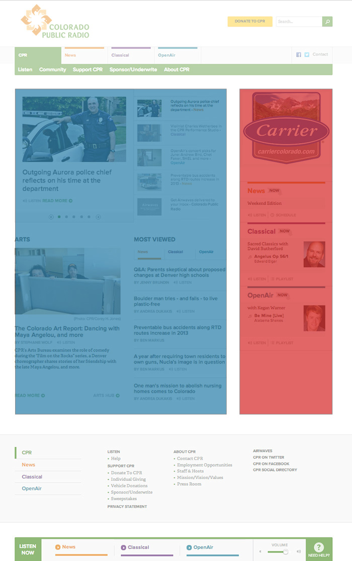
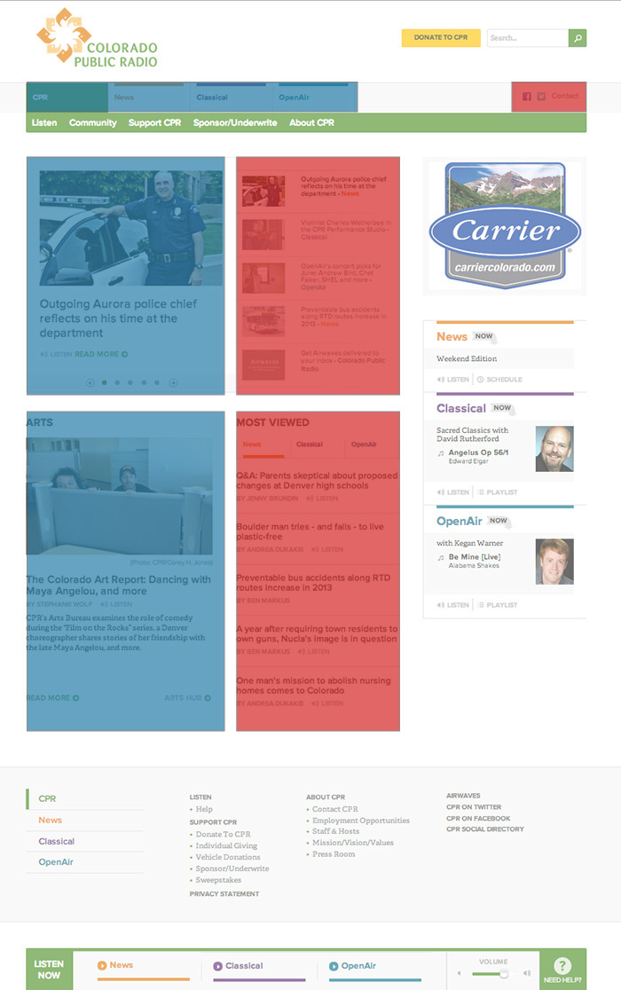
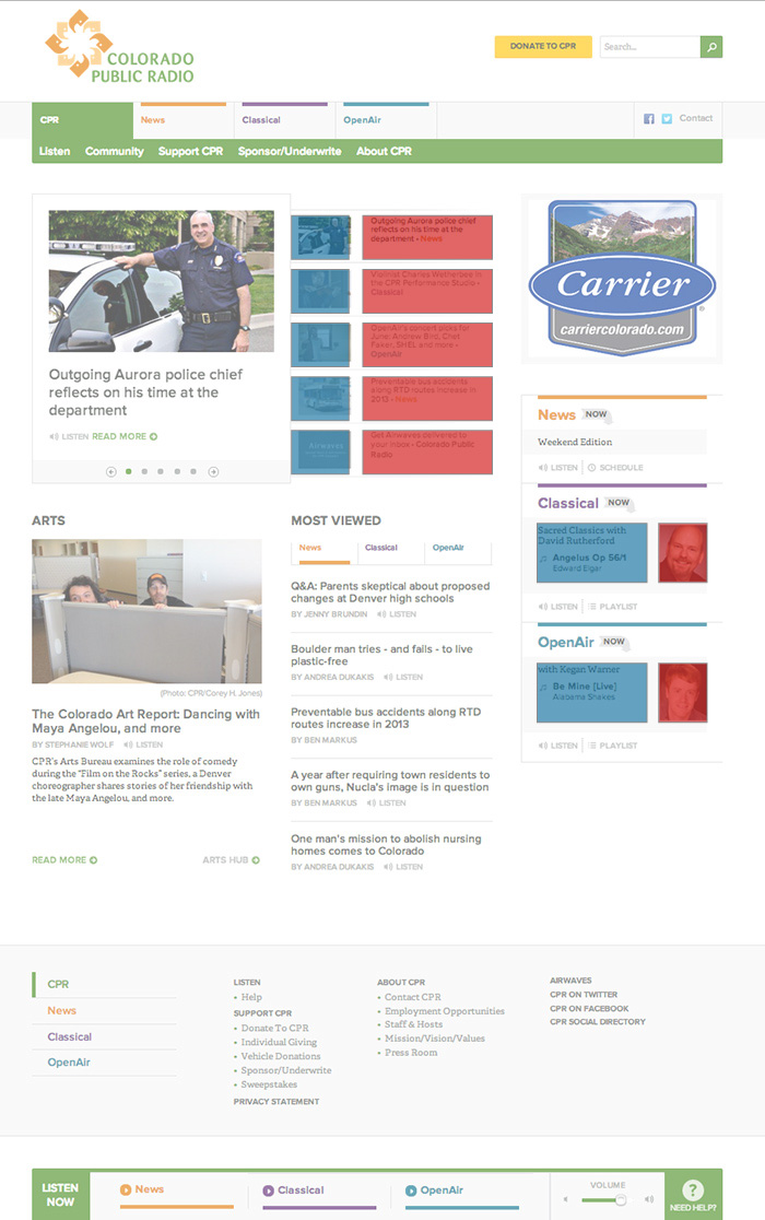
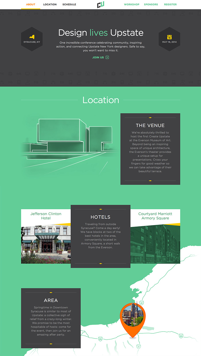
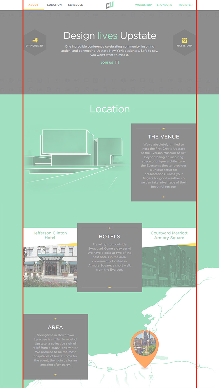
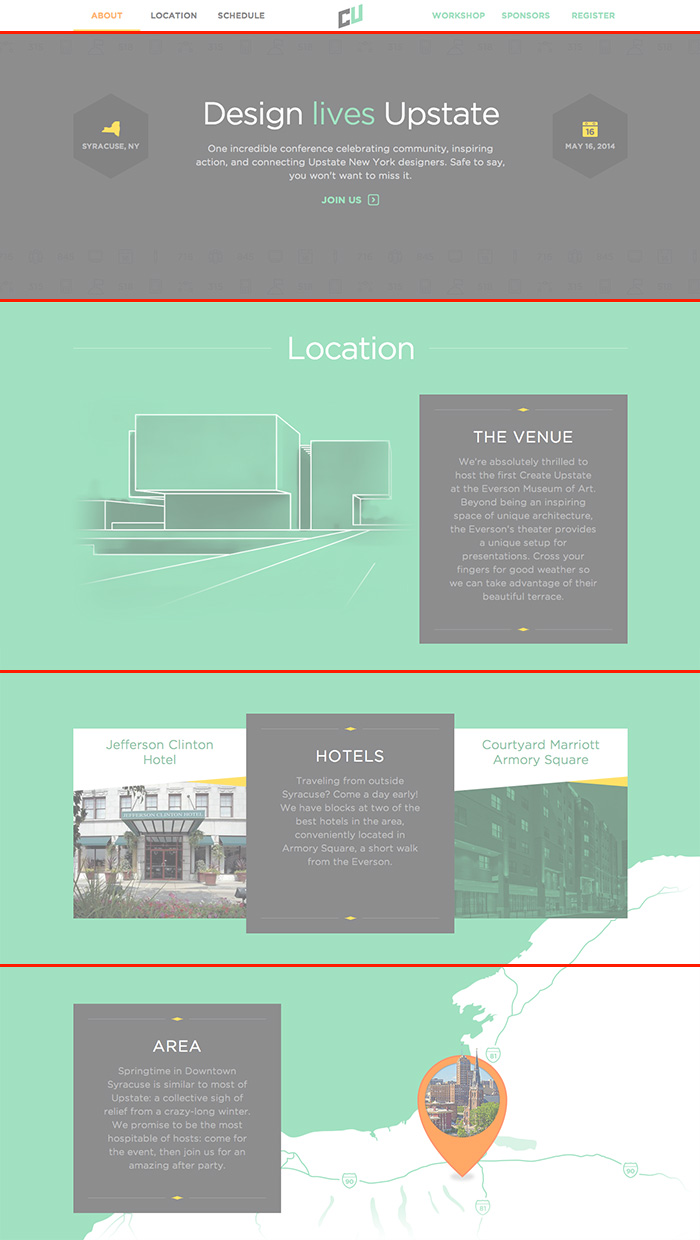
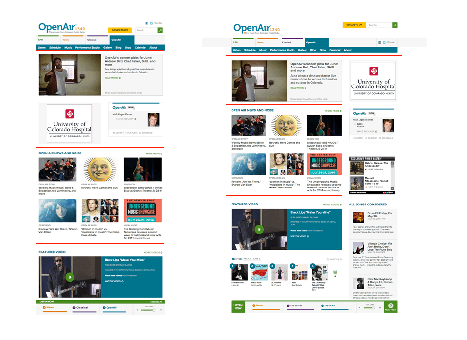
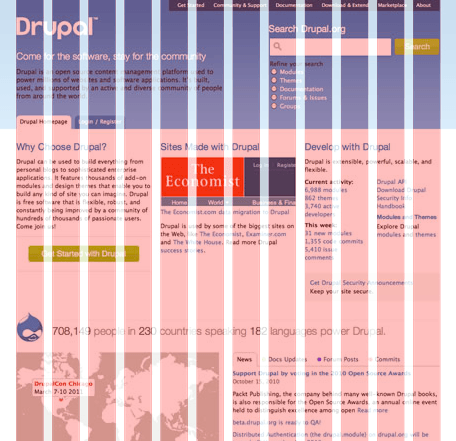
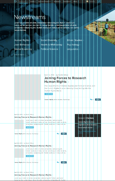
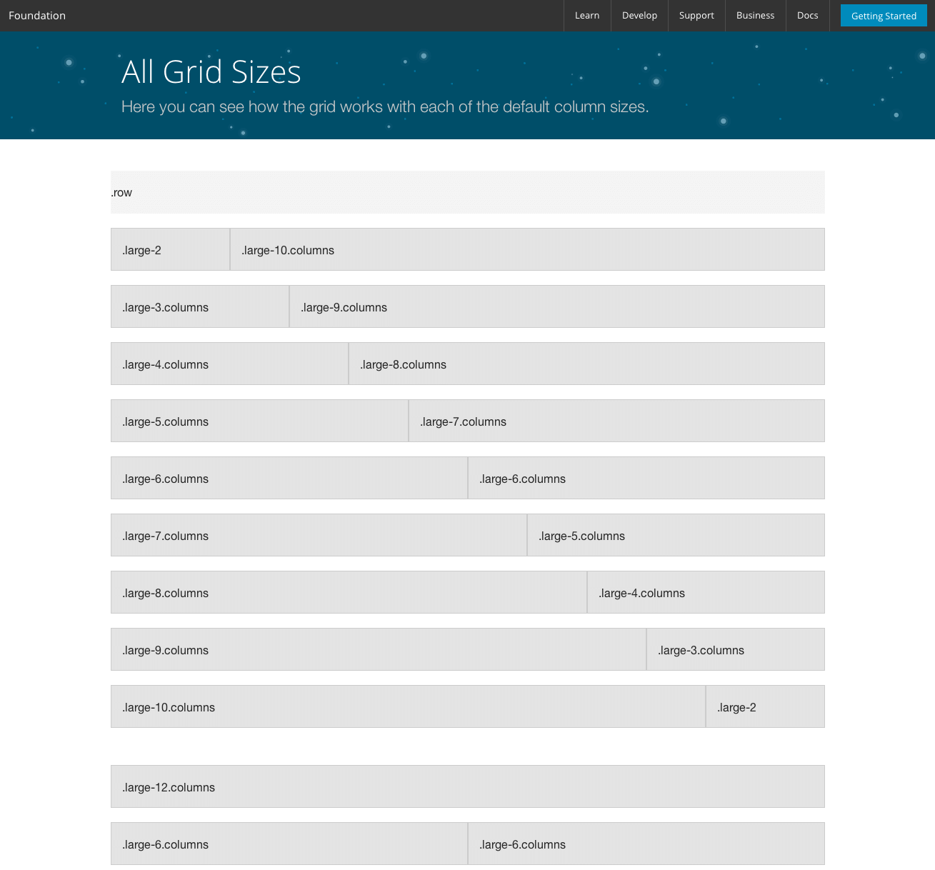
Rows of Relevant Content
Divide the screen into rows of relevant content such that the hierarchy and content relationships are preserved across different screen sizes.
"Divide the screen into rows of relevant content such that the hierarchy and content relationships are preserved when displayed in a linear format."
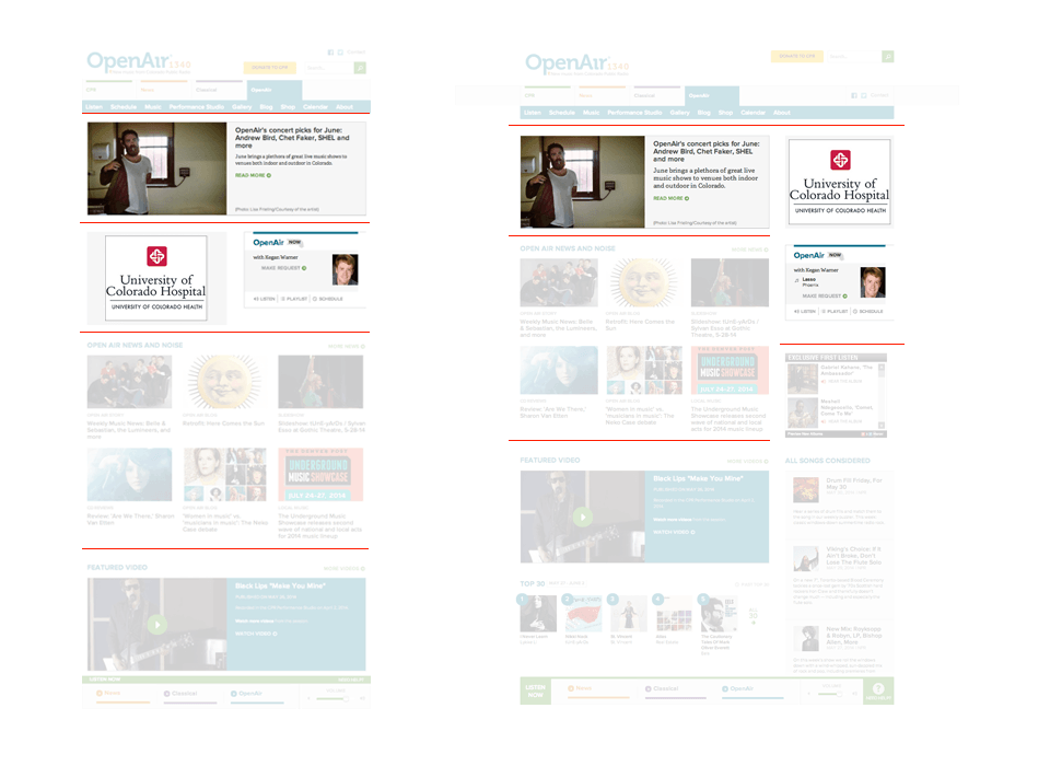
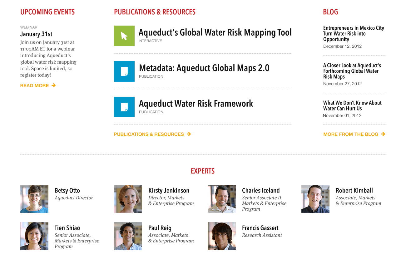
Let's look back at that last example
Here, we're using this pattern to divide the page into rows allows us to go full bleed with the background.
At first glance this looks like a typical single sidebar desktop layout
If that were the case, the information hierarchy would be thrown off on mobile layouts
Instead, we break the layout down into rows of relevant content so the hierarchy can be preserved at all screen sizes.
Instead, we break the layout down into rows of relevant content so the hierarchy can be preserved at all screen sizes.
Instead, we break the layout down into rows of relevant content so the hierarchy can be preserved at all screen sizes.
Layout Modifiers
Follow a naming convention for classes intended to modify layout.
The position of an element on the screen is affected just as much by the elements around it as its own CSS layout properties.
Reusable Layouts
.l--3-column {
> .l-primary { @include span(4 at 1); }
> .l-secondary { @include span(4 at 5); }
> .l-tertiary { @include span(4 at 9); }
}
.l--sidebars-after {
> .l-primary { @include span(6 at 1); }
> .l-secondary { @include span(3 at 7); }
> .l-tertiary { @include span(3 at 10); }
}
.l--sidebars-before {
> .l-primary { @include span(6 at 7); }
> .l-secondary { @include span(3 at 1); }
> .l-tertiary { @include span(3 at 4); }
}
.l--triptych {
> .l-primary { @include span(6 at 4); }
> .l-secondary { @include span(3 at 1); }
> .l-tertiary { @include span(3 at 10); }
}
Here is the markup for a 3 item structure. We have a container and 3 items
We've given each a class that represents their position
Here is a generic example of 3 elements.
.l-primary, .l-secondary, .l-tertiary.
And applied a modifier class to the container which defines the layout itself.
By giving the parent element a class of .l--3-columns, .l--triptych, .l--sidebars-after.
This is using a naming convention that is semantic to the layout itself and can be applied to many different elements.
This is a naming convention I've adopted for creating generic reusable layouts. You can use your own. You can use nth-child selectors or whatever. It's your world. The concept is the same.
By designing our layouts around these modifier classes, we make our layouts interchangeable and reusable.
Component Layouts
...
...
.article--teaser {
> .article-figure { ... }
> .article-header { ... }
> .article-content { ... }
}
Here is the same concept applied to an article node in which we use the view mode as our layout modifier
Here is a variation on that applies to a design component. In this case an article node using the teaser view mode.
Gutter Pull
Position an item by pulling
The position of an element on the screen is affected just as much by the elements around it as its own CSS layout properties.
The essence of this process is very fundamental indeed. We may understand it best by comparing the work of a fifty-year-old carpenter with the work of a novice. The experienced carpenter keeps going. He doesn't have to keep stopping, because every action he performs, is calculated in such a way that some later action can put it right to the extent that it is imperfect now. What is critical here, is the sequence of events. The carpenter never takes a step which he cannot correct later; so he can keep working, confidently, steadily.
Drawings help people to work out intricate relationships between parts.
Christopher Alexander
The novice by comparison, spends a great deal of his time trying to figure out what to do. He does this essentially because he knows that an action he takes now may cause unretractable problems a little further down the line; and if he is not careful, he will find himself with a joint that requires the shortening of some crucial member – at a stage when it is too late to shorten that member. The fear of these kinds of mistakes forces him to spend hours trying to figure ahead: and it forces him to work as far as possible to exact drawings because they will guarantee that he avoids these kinds of mistakes.
Let's look again at our article example
We have a series of elements but we want to pull just the thumbnail into the gutter and let the rest float around
We first add padding to create our gutter
Then float our item, give it a width, and pull it into the gutter
This works with a fluid width item
and also fixed width items
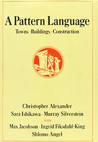
A Pattern Language
by Christopher Alexander, Sara Ishikawa, Murray Silverstein and Max Jacobson (1977)
At the core of these books is the idea that people should design for themselves their own houses, streets, and communities. This idea may be radical (it implies a radical transformation of the architectural profession) but it comes simply from the observation that most of the wonderful places of the world were not made by architects but by the people.
    ...
    ...
    ...
...
  .book--teaser {
    padding-left: 10em;
  }
  .book--teaser {
    padding-left: 10em;
  }
  .book--teaser > .book-cover {
    width: 8em;
    float: left;
  }
  .book--teaser {
    padding-left: 10em;
  }
  .book--teaser > .book-cover {
    float: left;
    width: 8em;
    margin-left: -10em;
  }
  .book--teaser {
    max-width: 32em;
    padding-left: 10em;
  }
  .book--teaser > .book-cover {
    float: left;
    width: 8em;
    margin-left: -10em;
  }
Let's look again at our article example
We have a series of elements but we want to pull just the thumbnail into the gutter and let the rest float around
We first add padding to create our gutter
Then float our item, give it a width, and pull it into the gutter
This works with a fluid width item
and also fixed width items
Margin Overflow
Allow an element to overflow its container by applying negative margins to both left and rights sides.
Layout Design Patterns
Layout Design patterns are recurring solutions that solve common layout design problems.
  .block-title {
    margin-right: -4em;
    margin-left: -4em;
  }
Take this block title for example
We can exploit the fact that negative margins on an element without a defined width, will increase its implicit width.
Now we have a fancy block title.
Everyone is aware that most of the built environment today lacks a natural order, an order which presents itself very strongly in places that were built centuries ago.
In short, no pattern is an isolated entity. Each pattern can exist in the world only to the extent that is supported by other patterns: the larger patterns in which it is embedded, the patterns of the same size that surround it, and the smaller patterns which are embedded in it.
The more living patterns there are in a place - a room, a building, or a town - the more it comes to life as an entirety, the more it glows, the more it has that self-maintaining fire which is the quality without a name.
  .l--3-columns > .l-column {
    box-sizing: border-box;
    float: left;
    width: 33.333%;
    padding: 0 2em;
  }
  .l--3-columns {
    margin-right: -2em;
    margin-left: -2em;
  }

  .l--3-columns > .l-column {
    box-sizing: border-box;
    float: left;
    width: 33.333%;
    padding: 0 2em;
  }
We use this same pattern to compensate for the outer padding in a grid layout.
Intrinsic Ratios
When the aspect ratio of an element is known, but the target size is not, use padding and absolute positioning to preserve the aspect ratio of an element.
  .video {
    position: relative;
    padding-top: 62.25%;  // Video height / width.
    height: 0;
  }
  .video {
    position: relative;
    padding-top: 62.25%;  // Video height / width.
    height: 0;
  }

  .video-inner {
    position: absolute;
    top: 0;
    height: 100%;
    width: 100%;
  }
This is most often used when dealing with iframes or embedded videos. max-width: 100% and height of auto work because the browser can determine the intrinsic ratio of an img from the file itself.
.video-container
> .video
Vertical padding defined as a percentage, is actually a percentage of the width of the element, not the height as you might expect. Taking advantage of this, we can set the top padding on the container and absolutely position the inner element as 100% x 100% and viola we have responsive video that respects the intended aspect ratio.
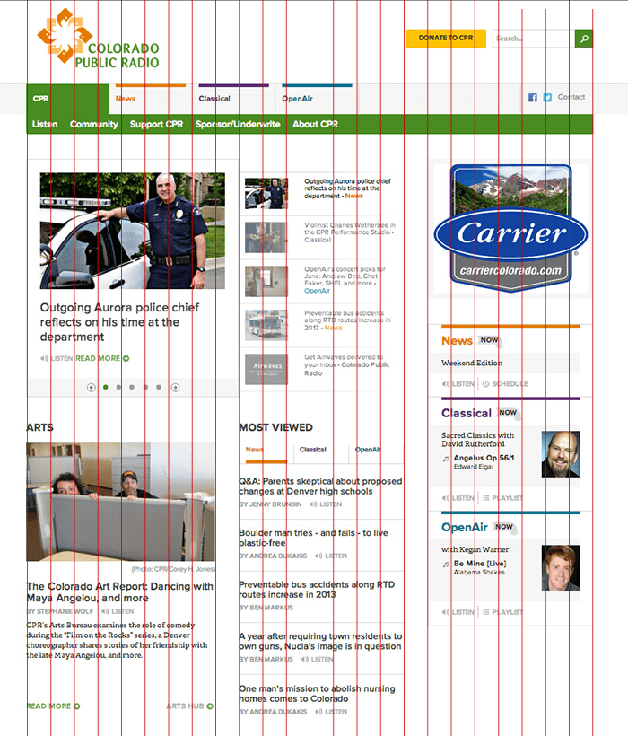
A grid system helps you create visual harmony and order on a screen by keeping elements aligned on the page.
Divide the screen into a series of vertical columns to facilitate the organization and alignment of components.
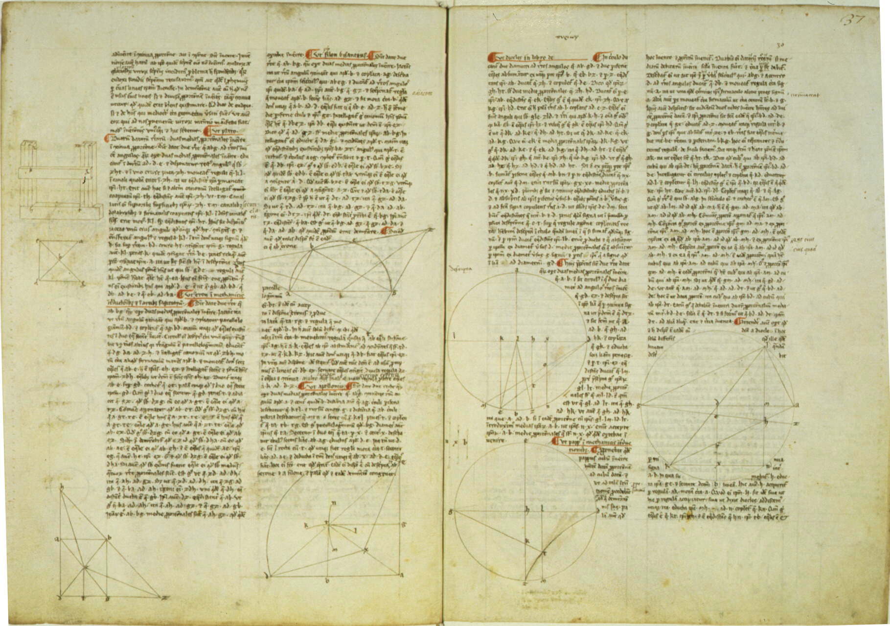
Grids have been used in page layout since the medieval times. Scribes diagrammed their pages to ensure that the text had the same depth and measure from page to page.
Grids have been used in page layout since the medieval times. Scribes diagrammed their pages to ensure that the text had the same depth and measure from page to page.
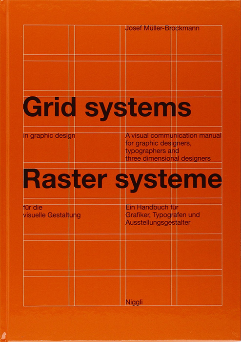
"In 1961, Josef Muller published Grid Systems in Graphic design."
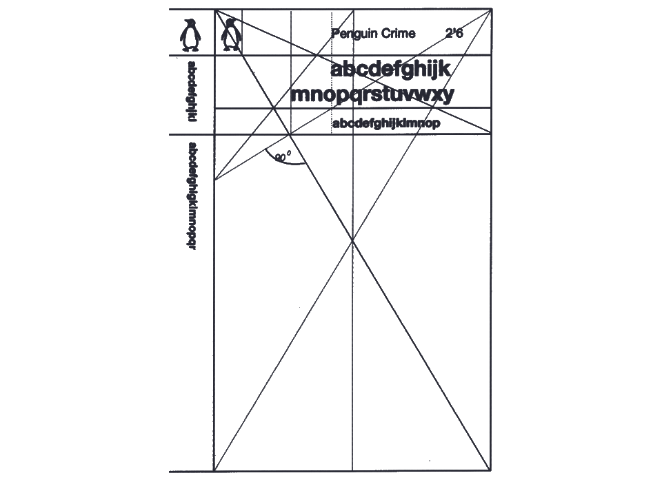
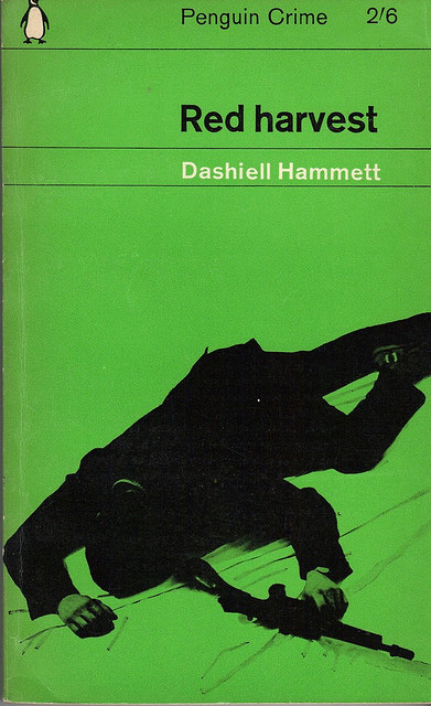
"That same year a Polish graphic designer named Romek Marber, conceived a grid layout for Penguin book covers that became one of the most praised and recognized layouts of all time."
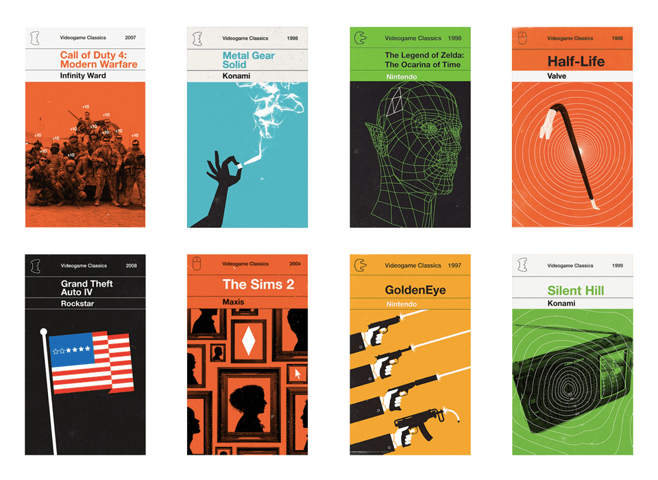
A few years ago, Olly Moss did a series of classic video game covers in the style of Penguin books and the Marber Grid.
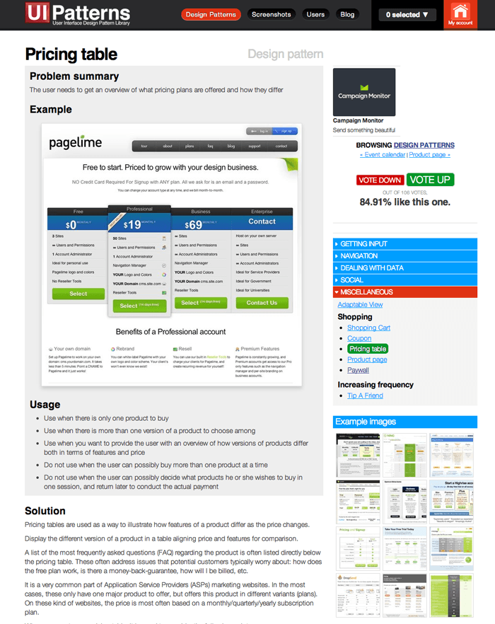
Here we have a design using a sixteen column grid.
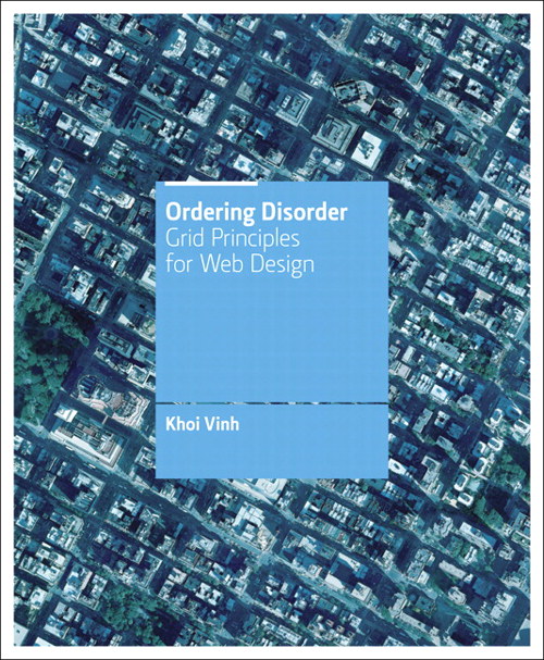
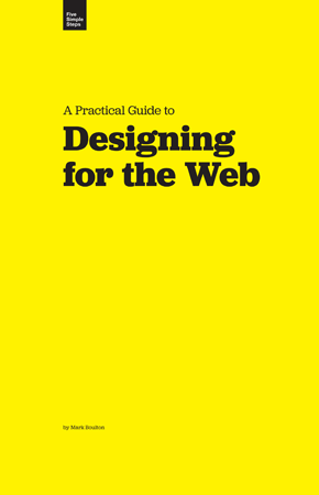
I'm not going to dwell on why you should use a grid system. If you need convincing, I suggest reading Ordering Disorder by Khoi Vin or Designing for the Web by Mark Boulton.
I'm much more interested in patterns for actually implementing grids on the web.
Guttered Grid
For each grid unit in the grid system, include a gutter to help space content.
Gutter-less Grid
Exclude gutters from the grid unit. Instead, use empty columns as gutters.
Symmetric Grid
Construct the grid from equal width grid units.
Asymmetric Grid
Construct the grid from varied width grid units designed for content.
Class-based Grid System
Align elements to the grid
A class based grid system is what you might recognize from grid systems like 960gs and or Bootstrap.
These provide classes like span-3 or span-6 that you apply to elements.
These are great for creating quick layouts and especially suited for prototyping.
Works well when grid classes can be applied with ease to the markup.
Can be tricky to implement in Drupal depending on which elements you want to apply your grid classes to.
Semantic Grid System
Align elements to the grid
The semantic grid system pattern allows you to abstract the calculations involved in aligning elements to the grid by using a preprocessor.
            // Singularity - http://singularity.gs/
.l--sidebar-after {
  > .l-primary   { @include grid-span(8, 1, 12); }
  > .l-secondary { @include grid-span(4, 9, 12); }
}
// Susy - http://susy.oddbird.net/
.l--sidebar-after {
  > .l-primary   { @include span(8 at 1 of 12); }
  > .l-secondary { @include span(4 at 9 of 12); }
}
// Zen Grids - http://zengrids.com/
.l--sidebar-after {
  > .l-primary   { @include zen-grid-item(8, 1, $column-count: 12); }
  > .l-secondary { @include zen-grid-item(4, 9, $column-count: 12); }
}
This allows more flexibility. You can apply grid math to padding, margins, widths or even things like text-indent.
It allows you to change the grid as needed. And apply properties to any selector.
Most offer direct access to the grid math functions so you can apply grid dimensions to any property manually, such as text-indent.
Flow Layout
Create columns by inlining a series of elements with defined widths, allowing elements to wrap as needed.
  .l--3-columns > .l-column {
    width: 33.333%;
  }
  .l--3-columns > .l-column {
    width: 33.333%;
    float: left;
  }
  .l--3-columns > .l-column {
    width: 33.333%;
    float: left;
    box-sizing: border-box;
    padding: 0 2em;
  }
  .l--3-columns > .l-column {
    width: 50%;
    float: left;
    box-sizing: border-box;
    padding: 0 2em;
  }
Isolation Layout
Given a series of floated elements, give each a negative trailing margin in order to reset the orientation of the following element.
  .l--isolation {
    > .l-primary {
      width: 33.333%;
    }
    > .l-secondary {
      width: 33.333%;
    }
    > .l-tertiary {
      width: 33.333%;
    }
  }
  .l--isolation {
    > .l-primary {
      width: 33.333%;
      margin-right: -33.333%;
    }
    > .l-secondary {
      width: 33.333%;
      margin-right: -33.333%;
    }
    > .l-tertiary {
      width: 33.333%;
    }
  }
}
  .l--isolation {
    > .l-primary {
      width: 33.333%;
      margin: 0 -100% 0 66.666%;  // margin-right: -1 * (margin-left + width)
    }
    > .l-secondary {
      width: 25%;
      margin: 0 -50% 0 25%;  // margin-right: -1 * (margin-left + width)
    }
    > .l-tertiary {
      width: 33.333%;
    }
  }
}
  .l--isolation {
    > .l-primary {
      width: 42%;
      margin: 0 -100% 0 58%;  // margin-right: -1 * (margin-left + width)
    }
    > .l-secondary {
      width: 33.333%;
      margin-right: -33.333%;
    }
    > .l-tertiary {
      width: 33.333%;
    }
  }
}
  .l--isolation {
    > .l-primary   { float: left; }
    > .l-secondary { float: right; }

    > .l-tertiary {
      clear: left;
      float: left;
    }
  }
}
## It's been applied extensively to User Interface design
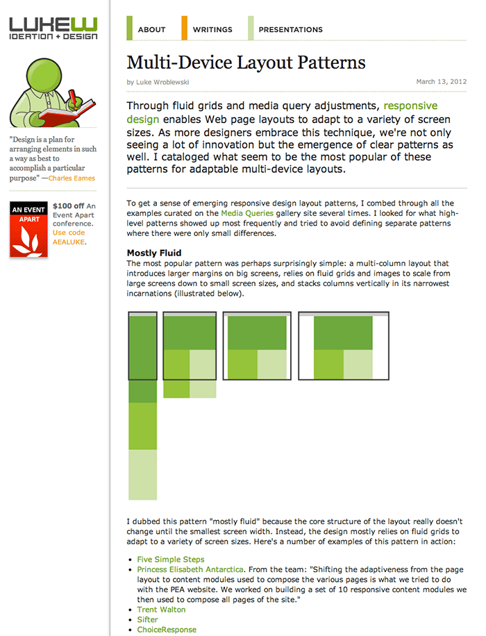
and in blog posts by Luke W about Multi-device Layouts
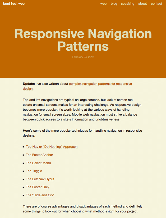
and Brad Frost's mobile navigation patterns.
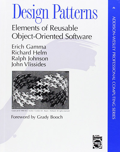
The concept was applied to Computer Science when Design Patterns: Elements of Reusable Object-Oriented Software was published in 1994 by the Gang of Four
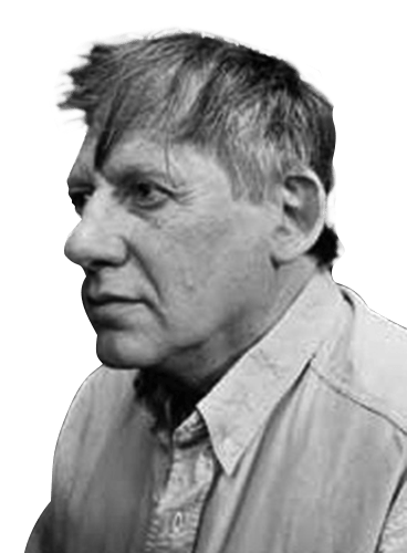
The concept of design patterns didn't originate from graphic design or computer science. It actually comes from Architecture.
An architect named Christopher Alexander, while teaching at UC Berkley in 70's, put forth a theory called "The Timeless Way of Building" in which he described a method of design driven not by the FORM of the building, but by the HUMAN INTERACTIONS the building is meant to facilitate.
He went on to publish "A Pattern Language", in which he and his colleagues document 253 architectural design patterns observed in some of the most timeless and well designed places throughout the world.
These patterns are not limited to buildings themselves. They address problems on a much larger scale. Those related to designing entire regions, cities, neighborhoods-- recursively, just like our layouts-- down to the home, its entry way, built-in furniture and decorations on the wall.
Using this pattern language as guide, anyone could design, simply by applying the appropriate solution in the context of their particular design problem.
https://flic.kr/p/ngz4YL
Alexander's patterns came from observing places that are alive.
In Pattern 241, Seat spots he writes
"Choosing good spots for outdoor seats is far more important than building fancy benches. Indeed, if the spot is right, the most simple kind of seat is perfect.
In cool climates, choose them to face the sun, and to be protected from the wind; in hot climates, put them in shade and open to summer breezes. In both cases, place them to face activities."
They didn't just make this pattern up. Him and his student's went out on campus and people watched for days. They took notes on which benches were occupied and which weren't. Which benches people were drawn to and which sat empty.
Design Patterns are not designed.
Design Patterns are observed.
The seat spots pattern didn't come from some blogger declaring "GOOD SEATS have cushions!" in a post titled 'Best Practices in Bench Design.'" NO! It was developed by observing existing solutions to the I need a place to sit problem.
So as designers and developers, what does that mean for us?
Start looking for patterns
Try to identify reoccurring problems in your day to day work. Are you solving these problems with a common solution?
Be mindful of feel good code.
If you come up with a solid solution that just feels bullet proof and can be applied in a bunch of different ways, WRITE IT DOWN.
Make it Repeatable.
Try to define the core of the solution. "What about this can be abstracted to make it useful in a wider context."